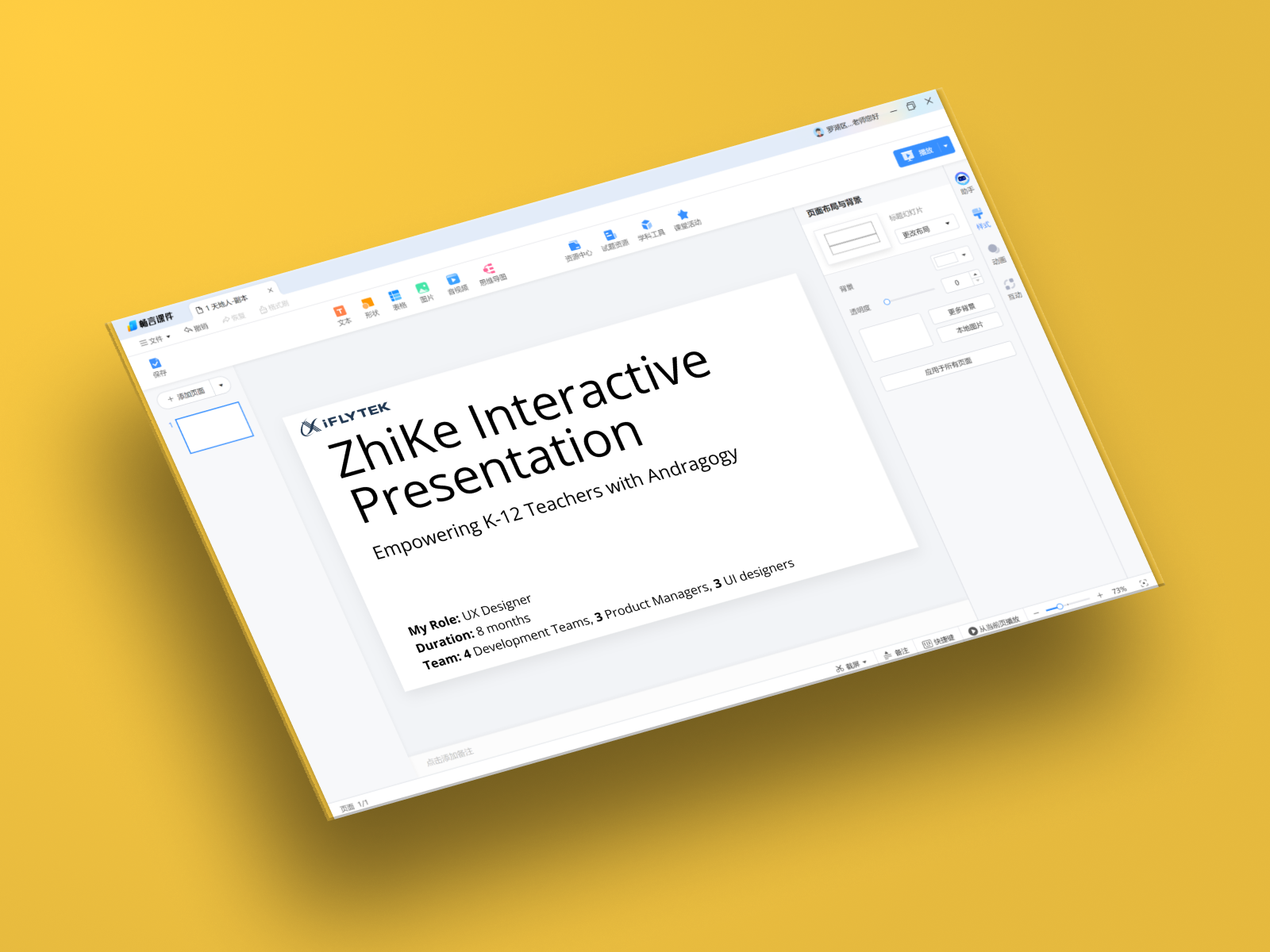
ZhiKe Classroom Presentation
Unified Teaching Experience for K-12 Educators
Streamlined classroom technology from 3+ fragmented tools into one integrated platform, increasing teacher adoption by 40% and classroom engagement by 35%.
Streamlined classroom technology from 3+ fragmented tools into one integrated platform, increasing teacher adoption by 40% and classroom engagement by 35%.
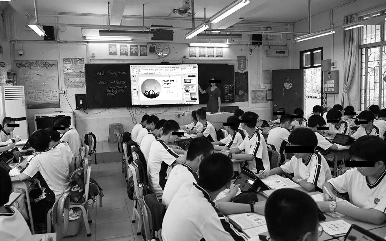
K-12 teachers were juggling 3+ fragmented apps during lessons (PowerPoint + textbook app + activity tools), disrupting learning flow and wasting 12+ hours weekly on content prep.
Designed a unified education-first platform that eliminated app-switching by integrating presentations, digital textbooks, AI content assistance, and classroom activities into one seamless workspace.
Lead the UX Design for 8 months, conducting teacher research, designing cross-platform experiences, and collaborating with 10+ members in development and product teams.
Key Insight: Teachers don't want to learn presentation software; they want software that already understands teaching.
The Challenge
Teaching requires real-time interaction—PowerPoint's linear structure couldn't adapt.
PowerPoint overwhelmed educators with boardroom features instead of classroom-specific tools.
Constant app-switching broke teaching momentum and caused distraction for students.
What We Discovered
of teachers use 3+ applications during a single class
hours weekly spent searching for teaching materials
hesitate to adopt new tools despite seeing flaws in current workflow
UI controls must be positioned for teachers to face the class while presenting
"I start with PowerPoint, then switch to the textbook app, then open the activity platform, then back to PowerPoint. My students lose focus every time I'm fumbling with technology instead of teaching."— Middle School Science Teacher
The Solution: Education-First Design
Access digital textbooks and AI-assisted content creation in one place
Embed interactive activities directly in presentations without switching apps
Move between presentation and classroom tools without leaving the interface
Control everything from positions that kept them facing students
Key Features
"For the first time, I feel like I'm using software that was actually designed for teaching, not something adapted from the business world."— Participating Teacher
Designing for teachers isn't just about making software "user-friendly"—it's about understanding classroom constraints like physical positioning, student attention spans, and lesson flow that traditional UX doesn't account for.
Managing 4 dev teams, 3 product managers, and 3 UI designers taught me that complex projects require constant communication bridges and shared design principles to prevent bottlenecking decisions.
When 87% of teachers hesitated to adopt new tools, deeper research revealed they needed proof any solution would save more time than it cost—shifting our entire onboarding strategy from ease-of-use to time-value demonstration.